

Red Tractor updates logo to 'differentiate' food
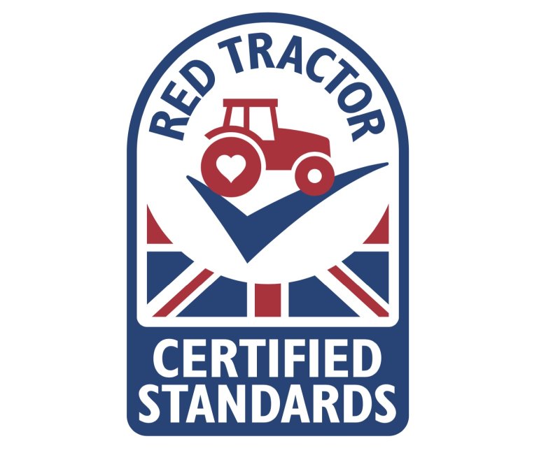
Red Tractor has launched a new logo which aims to set out the credentials of the food which carries the assurance scheme's name.
The updated design reflects the work that Red Tractor has been undertaking to help improve its status and emotional engagement with consumers.
The new logo retains the union flag to signify that the product has been grown, reared, processed and packed in the UK.
"The new visual identity addresses a number of the challenges that the British food and farming industry face," the assurance scheme said, adding that it "clearly differentiates to consumers the food which has been carefully produced to world-leading standards."
Key changes to the logo include an updated tractor to modernise its appearance and the words ‘Certified Standards’ to clarify what Red Tractor does.
The red tractor now sits on a ‘tick’ to help shoppers indicate that the product has been checked.
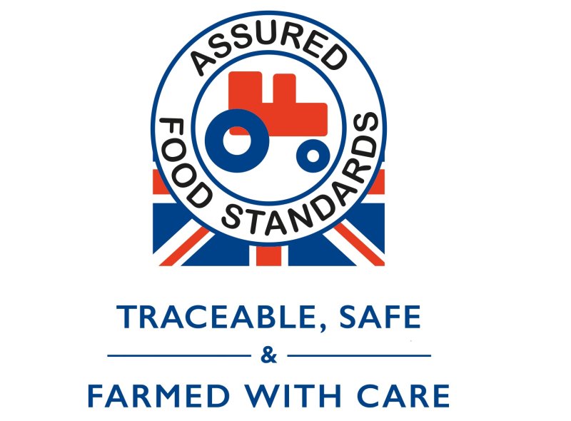
Red Tractor CEO Jim Moseley said: "The logo was designed to be very utilitarian. Two decades on, we are facing a new watershed moment, with the market facing huge uncertainty with the ongoing trade negotiations.
"At this time it is critical that we help shoppers to clearly differentiate which food has been produced and checked to world-leading standards from farm to pack – and the simplest way to do this is to look for the Red Tractor and the tick."
The roll out of the new logo is expected to take around 18 months as many of the UK’s popular brands update their packaging.
It will be supported by a new £2 million ‘Tractor Test’ campaign, designed to increase shopper understanding of Red Tractor.